Customise Rickshaw graphs for fun and profit
If you have the need for graphs within your app there’s a few options open to you: D3 or Rickshaw being two of them. We went with Rickshaw because this actually takes D3 and builds on top of it to offer additional features that wrap and hide some of the complexity. However we wanted something more custom, so we extended it. Here’s how…
Graphing analytics
Okay, now this might be a little specific by way of a requirement, but heck that’s what this post is all about, so hear me out. We gather analytics in one of our products from the usage of resources that are part of a time-based collection.
Previously we were only graphing these analytics for the start and end dates that matched those of the collection that the resource belonged to.
This didn’t help when viewing the graphs as usage outside of the start and end dates was not being shown.
Our UX designer came up with this design as the solution:
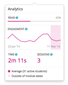
Notice the pink rectangular region on the “Engagement” line graph? This solves the problem by showing a pink background behind the line series that indicates activity outside of the original collection start and end dates.
Looks great, but how could we achieve this?
Extend Rickshaw
Rickshaw allows you to specify the renderer to use for the data you provide, these can be: area, stack, bar, line, scatterplot etc. Additionally specifying “multi” allows you to support different renderers per data series that you supply.
We changed the graph renderer to “multi” and added another series that used a bar graph to act as the indication for analytics outside of the start and end dates.
However, the standard behaviour for Rickshaw is to show hover labels for all points that are plotted. We definitely wanted this behaviour for the line series that represented the usage, but did not want hover labels to show for the bar graph series.
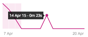
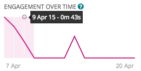
So we wanted this:
But did not want this:
We started by adding a noHoverDetail attribute to the bar series that we were adding to Rickshaw:
    // color is set to an rgba value to enable us to get pink with opacity
    data: $scope.analytics.avTimeByDayForUser,
    renderer: "bar",
    color: "rgba(197, 25, 125, 0.10)",
    noHoverDetail: true
Note: we are using AngularJS, so you’ll see reference to us using $scope in the above code.
Then we extended Rickshaws HoverDetail class to have a different behaviour for any series that had this attribute set:
    graph.render();

    var Hover = Rickshaw.Class.create(Rickshaw.Graph.HoverDetail, {
        render: function($super, args) {
            // get the current point we are dealing with
            var point = args.points.filter( function(p) {
                                            return p.active }
                                            ).shift();

            if (point.value.y === null) return;

            // check if the series we are dealing with has the "noHoverDetail" // attribute set to true. If so, we don't want to render this
            // hover detail item, if not call the original render method as
            // normal
            if (point.series.noHoverDetail !== true) {
                $super(args);
            }
        }
    });
So now we don’t get the Rickshaw hover label showing for any series that has been added with the “noHoverDetail” attribute.
But wait, what about those gaps between the bars on the bar chart series we are using to show the usage outside the dates?! That doesn’t match the UX designers design now does it?
No more gaps
What we did for this was extend the Rickshaw Bar renderer class and create a new renderer called bar_no_gap so that the gap size was removed from the calculation of the bar width.
    // create a custom bar renderer that has no gaps
    Rickshaw.Graph.Renderer.BarNoGap = Rickshaw.Class.create( Rickshaw.Graph.Renderer.Bar, {
        name: 'bar_no_gap',
        barWidth: function(series) {
            var frequentInterval = this._frequentInterval(series.stack);
            var barWidth = this.graph.x(series.stack[0].x + frequentInterval.magnitude * 1);
            return barWidth;
        }
    });
Then you have to register this new renderer with Rickshaw ahead of the graph.render method call:
    // register custom bar renderer
    graph.registerRenderer(new Rickshaw.Graph.Renderer.BarNoGap(
                                                    {graph: graph}));
    graph.render();
Now all we need to do is remember to specify this new renderer when we add the bar series:
// color is set to an rgba value to enable us to get pink with opacity
data: $scope.analytics.avTimeByDayForUser,
renderer: "bar_no_gap",
color: "rgba(197, 25, 125, 0.10)",
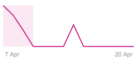
noHoverDetail: trueAnd with that, it looks a lot closer to the UX design:
Conclusion
So in conclusion, you can take an already awesome charting library - Rickshaw - and extend it to your hearts content - these are just a couple of simple ways we did that to satisfy our specific requirements.